 Chord diagram for global bilateral migrant stocks
Global migrant populations visualized using animated chord diagrams
Over the last year or so I have been playing around with different ways of showing changing global bilateral migrant stocks, adapting the animation code I created for the plots for region to region flows in this estimation paper. I am putting them online here in case they are of interest to anyone else. Feel free to download the plots using right click over the animation and then Save Video as or from Github.
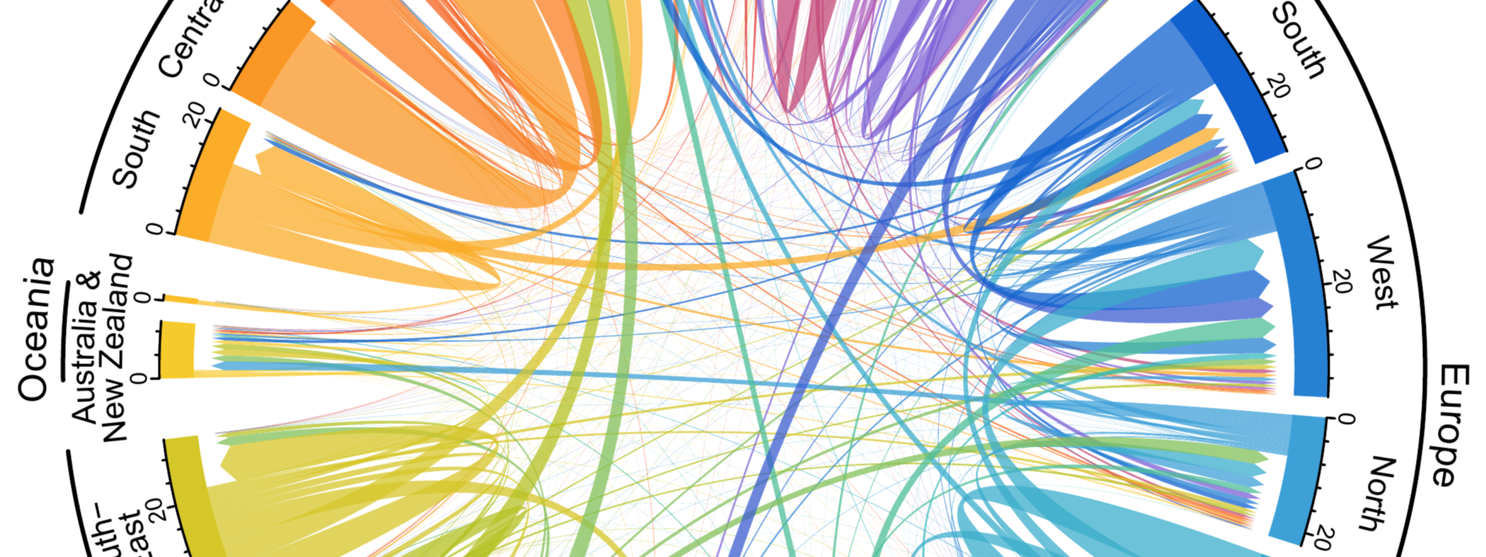
Global migrant populations from 1990 to 2020
The first plot below shows the change over time in the pattern of global migrant stocks. As with the regional plots in my previous post, the chords in the diagrams represent the connection between the places of birth (at the base of the chord) and places of residence (at the arrow head of the chord). The width of based of the chords correspond to the size of the migrant population in millions. Chords are ordered relative to their size, with the largest migrant stocks plotted at the beginning of the region segments. The ordering of chords jumps around over time as the relative rankings of the largest foreign-born populations change in each region. Values for the migrant population sizes are from the 2019 2020 revision of the United Nations DESA International Migrant Stock Data.
Note: you might have to right click, select show controls and hit play to start the animations depending on your browsers - right clicking can also allow you to access controls on the play back speed.
Male and female migrant populations
The next two plots below show the differences between male and female global migrant distributions in 2020. In the first plot I keep the sector axis fixed at their maximums (over both sexes) making it easier to detect changes in the relative volume of a particular migrant corridor; for example the greater number of male migrants in West Asia and slightly more female migrants in North America.
In the second plot, I allow the sector axis to be specific to the regional totals. This (perhaps?) makes it easier to detect relative changes in the overall global patterns by sex.
Migrant populations relative to total populations
One important feature of international migrants are their relative rarity. Professor Hein de Haas visually illustrates this point neatly using a pie chart, where his focus is predominantly on refugees, but also clearly shows the small share of the global population that are living outside their country of birth (under 4%). This feature is completely missed in the migrant chord diagrams above, where there is no way to gauge the share of the migrant populations relative to the total population. In the plot below I tried to illustrate the relative sizes of migrant populations using the lengths of the sector axis, transitioning between
- The number of migrants (which is a combination of migrant living in the region and migrants born in the region living elsewhere) as in the plots above, and
- The total population of the region.
The chord widths remain constant, fixed at the size of the bilateral migrant populations.
Refugee populations relative to total migrant populations
In the final plots I illustrate the relative sizes of forced migrant populations compared to the total migrant populations, transitioning the chords between
- The number of migrants from each origin and destination based on the UN IMS2020 stock data
- The number of forced migrants from each origin and destination based on data from UNHCR
In the first version the sector axis remain constant, fixed at the size of the bilateral migrant populations in each region.
In the second plot the sector axis vary to match the type of migrants (all migrants or forced migrants) so show the relative differences in patterns.
R Code
These plots were all produced in R, primarily using the chordDiagram() function in the circlize package. A while ago I wrote a post with details on creating animated chord diagrams. The specific code for the plots above gets a bit overwhelming (and is poorly commented) so I am hesitant to put it online, especially because the more complicated parts for defining the lines for the global regions can now be done much more easily using the new group argument in the chordDiagram() function, as described in a recent post by the circlize package creator Zuguang Gu.
Guy Abel
Professor
My research interests include migration, statistical programming and demographic methods.