 Asian bilateral migrant stocks
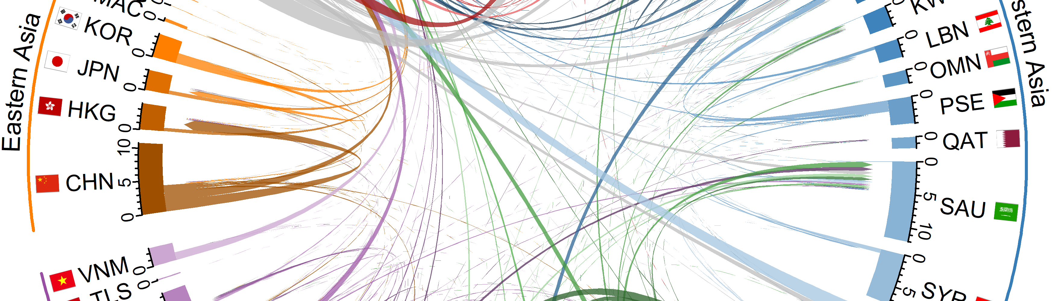
Regional migrant population changes visualized using animated chord diagrams
During the last few months I have given some introductory talks on international migration in Asia and Europe. I had a couple of requests to share the animated chord diagrams that I created for others to use in their teaching materials. These are below, along with some extra plots for Africa, the Americas (Northern, Central and Southern America as well as the Caribbean) and Oceania. Feel free to download the plots using right click over the animation and then Save Video as or from Github.
The chords in the diagrams represent the connection between the places of birth (at the base of the chord) and places of residence (at the arrow head of the chord). The width of based of the chords correspond to the size of the migrant population in millions. Chords are ordered relative to their size, with the largest migrant stocks plotted at the beginning of the country segments. The ordering of chords jumps around over time as the relative rankings of the largest foreign-born populations change in each country. Values for the migrant population sizes are from the 2017 2019 2020 revision of the United Nations DESA International Migrant Stock Data.
Note: you might have to right click, select show controls and hit play to start the animations depending on your browsers - right clicking can also allow you to access controls on the play back speed.
Asia
Europe
Africa
Americas
Oceania
The data in these plots represent migrant population totals, not period migration flows, hence the usual caveats associated with migrant stock data apply:
- Underlying migration flows might form different patterns as migrants might not be moving from their country of birth.
- Migrant populations can decrease from deaths as well as outward migration.
R code
As in my previous post on animated chord diagrams I used the circlize package in R to produce each chord diagrams for each frame of the animation and tweenr for the intermediate data. The country flags were added using the circos.raster() function in circlize. I used magick to read in the multipage PDF file of plots over time and animation to produce the MP4 file. I am beginning to prefer MP4 files to GIF as the file size are smaller - so quicker loading - and most browsers display MP4 videos with controls.
Guy Abel
Professor
My research interests include migration, statistical programming and demographic methods.