 Global population distribution
Animated population tree maps
Background
The global population hit 8 billion today. To mark the passing an absolute population total I created some animated tree map plots in R to visualize relative past and future population totals for all countries.
Plots
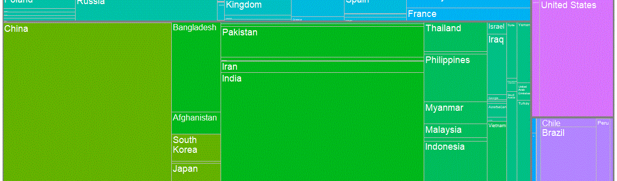
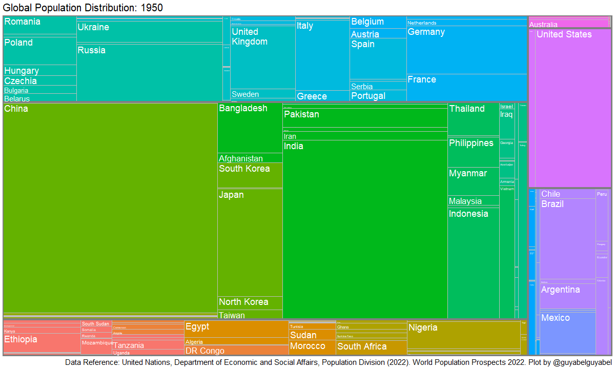
The first animated plot shows the changes over time in the distribution of population totals based on the latest United Nations data, provided in the wpp2022 package.
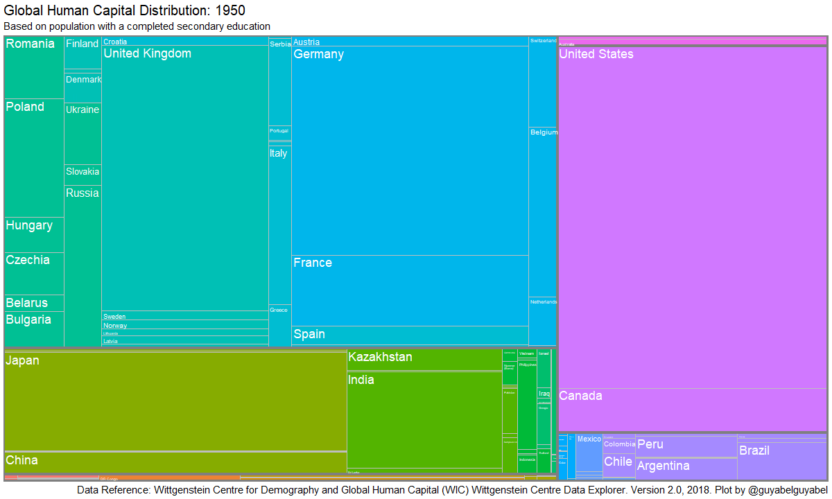
The second animation shows the changes over time in the distribution of population with at least a completed secondary education. Country estimates and projections were obtained from the Wittgenstein Centre for Human Capital and Demography via the wcde package that I helped develop. The past estimates of education specific populations are based on a method to breakdown the United Nations population data. However, the future population totals (and the relative size of each country) differ between the United Nations and the Wittgenstein Centre as each group use separate assumptions and methods in their projection models.
R Code
Commented code to create the animated plots below are in two Gist here and here. You can run the script directly in R using the following…
library(devtools)
# UN population data
source_gist("https://gist.github.com/guyabel/2307ecdd9844b6fd504b97144758a656")
# Wittgenstein Centre completed secondary education population data
source_gist("https://gist.github.com/guyabel/56f6b7750c44d1444675d93a599cccaa")
The first part of each script imports the data into R, adds the continent and region names to help order the layout, and adds short country names for labels used in the plot.
The second part of the code creates a function for a single tree plot in a specific year. The function is then used twice. First to animate past data and second to animate future data. I created separate animations to allow for a pause in the GIF at 2022 and to signal in the title that data for future population distributions are based on projections.
The key to the animating tree maps is to set layout = "fixed" in the geom_treemap() function (in the treemapify package). I chose to group the countries by continent and then sub-region, locating neighbouring counties in the same part of the tree map and using the same fill colour.
The third part of the code generates two separate GIF files for each time period and then combines them into one.
Guy Abel
Professor
My research interests include migration, statistical programming and demographic methods.